
Close to my heart has a few different inks, and they are great for a few different applications. Let’s talk about them for a minute, shall we?
First there is the Exclusive Inks which are Dye based inks. This is the group of inks that had the most colors. These inks will sink into the paper that you are stamping on.
Next are the pigment inks. These inks are thicker in consistency and are more opaque. When stamped on top of another image, they will blend less. These inks stay on top of the paper, and also take longer to dry.
Then there are specialty inks. Those are Archival Black, Intense Black, StazOn, and Versamark. They are do different things, and may look similar on your finished project, however, it’s all about using the right tool for the job.
Archival black is the blackest black ink that Close to my Heart has. I personally love this ink! It really is a true black color. This ink is archival safe and acid free. Once dry it is waterproof, lightfast, and fade-proof.
Intense black is also archival safe and acid free. Like Archival Black, it is waterproof once dry. This ink is fast drying and non-smearing.
StazOn is not an acid free ink, so you may not want to use it in your scrapbooks, however it is great for a good number of things, especially non-porous surfaces.
Versamark ink is an archival safe watermarking ink. This means it is a thicker, clear ink. It, like the pigment ink, will stay wet (or sticky) for a bit.
So, you are thinking “Ok, Michelle, so what ones do I use on what projects?”, right? Well, let me give you a few examples!
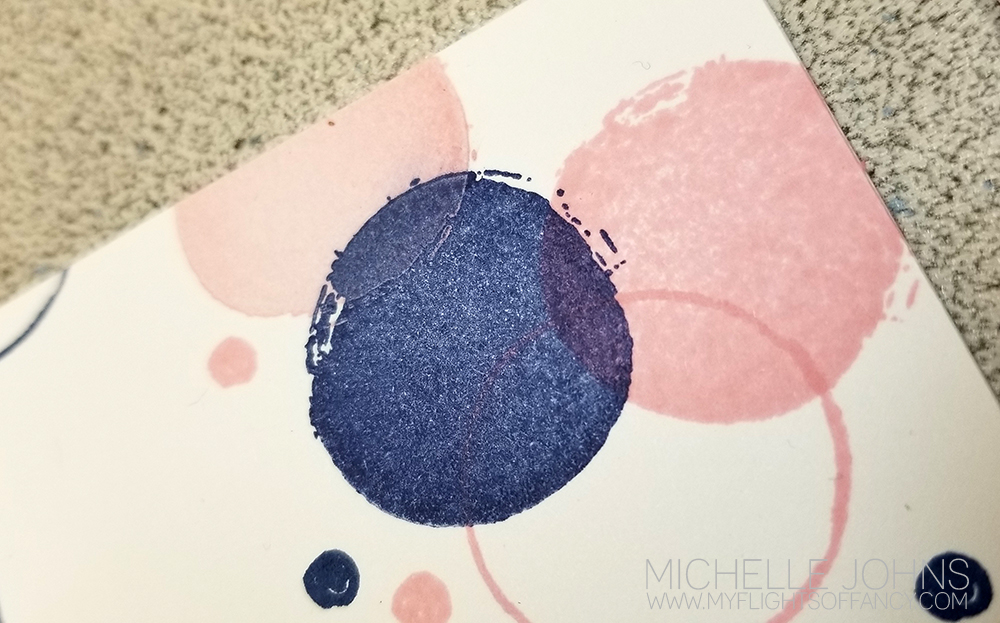
These first two cards I used the dye ink and pigment inks in both pixie and sapphire. You can see slight differences in the inks on the paper.

In this close up, on the right, you can see that the pixie and sapphire dye inks blend together where they overlap. On the left side of this little cluster, you can see the pixie pigment ink on top of the sapphire ink. It isn’t super obvious because pixie is such a light color, and sapphire such a dark color, however you can see the difference.
On this next example, I am using three types of ink. I used the Versamark ink to hold the white embossing powder for the lace doily. I used ballerina dye ink to sponge some color over top of it, and then I used the sapphire pigment ink for the sentiment, and used clear embossing powder over top of it. (this helped it dry so I could continue with my project, and tied the look into the doily that is under it) Since the versamark and the pigment inks stay wet/sticky for a bit, they hold embossing powder fantastically!

I used the dye ink to sponge, as the pigment ink would have stuck to the embossing powder, and I would have ended up with a look that I wasn’t really going for!

Now, for this post, I did not use Archival Black, Intense Black, or StazOn inks. The majority of my cards use Archival Black ink. This is one of my most recent uses. I will use Intense Black Ink if I am going to be using my alcohol markers, as the solvent in the markers will not pick up the Intense black ink. You can see the Intense Black ink and coloring on this project. I know I have used StazOn ink, however apparently it didn’t make my blog! Ack!
I hope this helps you to know which ink to use for which project! Still have questions? Let me know! I will gladly answer them for you!
Items used for today’s projects:
Value Card bases & Envelopes
White Daisy Cardstock
True Love Paper Packet
Sweet Girl Paper Packet
Into the Wild Paper Packet
Vellum
Ballerina Ink
Pixie Ink
Pixie Pigment Ink
Sapphire Ink
Sapphire Pigment Ink
Versamark
White Embossing Powder
Clear Embossing Powder
Colorful Texture Stamp Set
Love Right Now (Artistry Cricut Bundle)
Sweet & Lovely (Artbooking Cricut Bundle)
Basic Circle Thin Cuts
Stitched Circle Thin Cuts